
EduMe provides a way for companies to have more engaged and successful workforces and enables companies to create and deliver learning content and information to dispersed, non desk based workers, primarily over mobile. It equips workers with the knowledge and information they need to succeed in their role.
Leading product and design for EduMe. Working with the Tigo team in Columbia who I would be carrying out user testing and research sessions with and working with an internal team of x2 developers and x1 learning designer.
16% increase in revenue
70% course completion up from 40% - 70%
22 validated and MVP that went on to be what edume is today
000’s reduced in costs
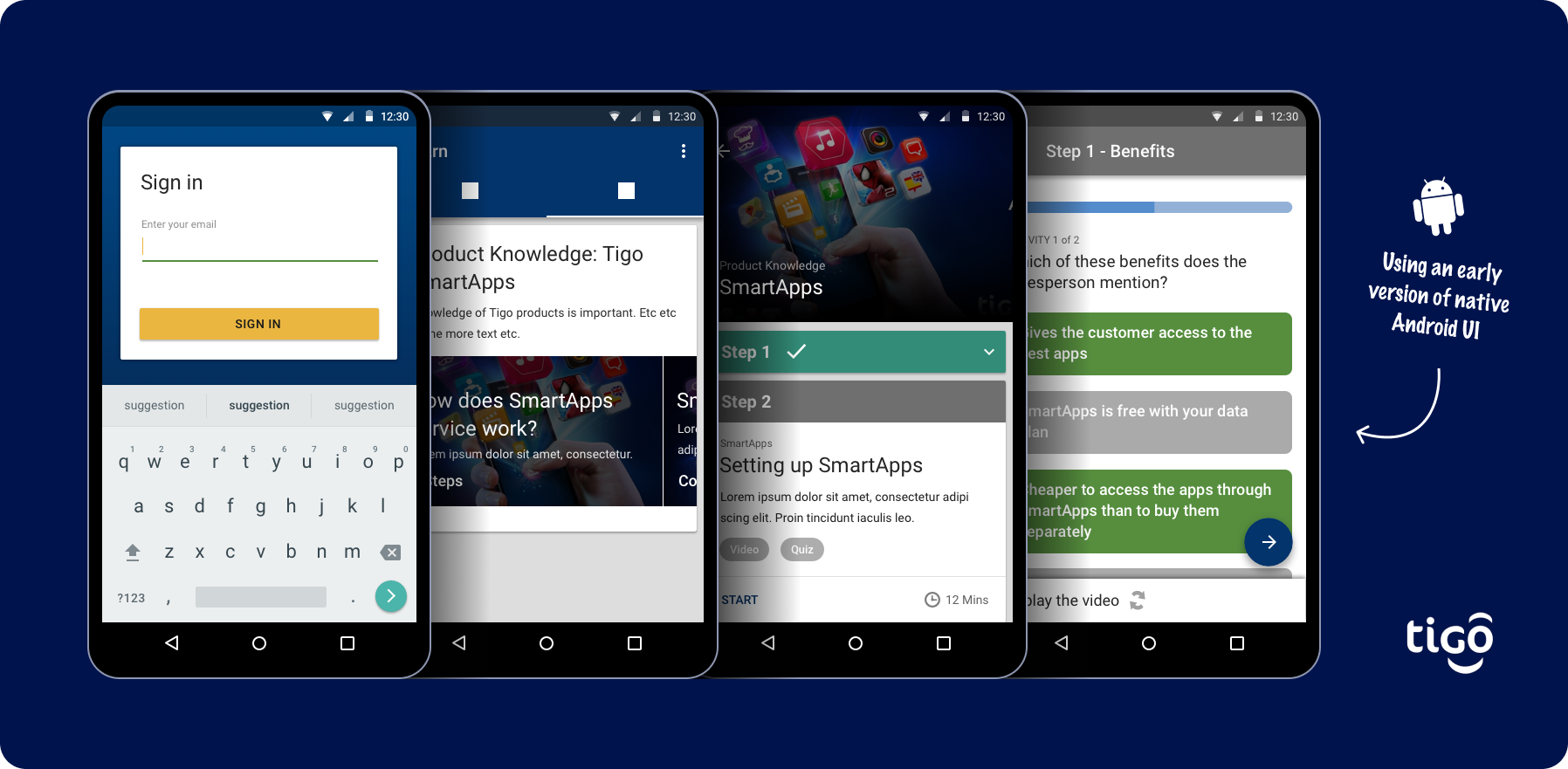
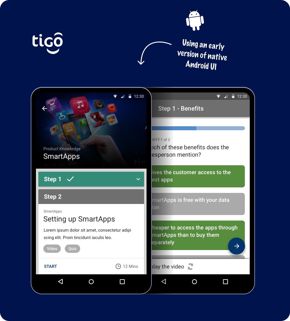
Our goal was to create an MVP to deliver information and training to freelance sales agents based in Columbia via their mobile device in an engaging and efficient way. Validate this way of delivering can work, provide the knowledge needed and deliver value to Tigo. It didn't need to be pretty - it needed to work. Oh, and we had 2 months 😬 **FYI - This wasn't a visual exercise, I used out of the box 'old Android' UI elements for speed so the UI isn't very pretty :) **
This was the first MVP of a product I lead the creation of that eventually turned into what EduMe is today - raising over $6m dollars in funding, over 2m registered users and $1m+ in ARR.
The work here leans more towards product approach, testing, fast MVP iteration, core product structure and less around in-depth UI and visual work - this came later. (I used the very early Android design language 'out of the box' with simple colour changes so it was pretty basic from a visual point of view).
EduMe was working with a telecoms brand in South America called Tigo who approached us with a problem around how they train their staff. They use freelance sales agents to sell mobile data and broadband packages - these agents have to basic knowledge around things like new products, how to activate accounts etc.
They were currently delivering face to face training in centres that were costly and not easily accessed by agents who may be based hours away across Columbia. Time is probably one of the most precious things the agents have. If they are being distracted from selling, they aren’t making money.
I began with a number of remote interviews, questionnaires and working very closely with the lead trainer in Columbia to learn more about them and discovered a number of problems.…
Talking to the team leads in Columbia we came up with a simple initial success measure and some stretch/longer terms goals so we could have something to aim for.
Informed by the research and to create some 'edges' for the project in which I could work within, I identified two main types of content Tigo needed to get to agents and some core principles I would follow while working on a solution
From research, 100% of agents had Android devices so we would be making an Android app. Our immediate metrics would be there to gauge successfulness of the MVP and general concept - to get senior buy-in and unlock further Tigo budget.
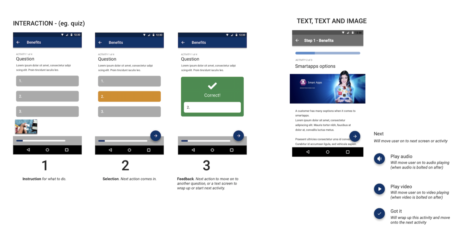
Working with the content creator I sketched out the basic structure of navigating the content. There was going to be 2 subject areas which would have many parts so we wanted to be able to have a good flow to encourage the learner to complete it. Content would be delivered as video as we believed this to be more engaging to reading lots of text - but the key would be to keep this short. All learning content would be kept to 3-5 minutes in length - the EduMe ethos is little and often. No pressure to do 4 hours worth of content in one chunk but more to encourage people to come back often - fitting in around their schedule so they can concentrate on selling first. This would make it important to have good feedback in terms of progress and completion
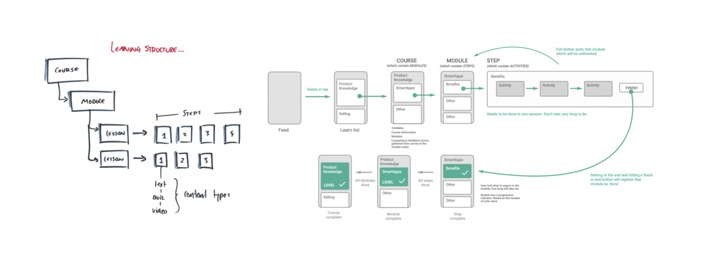
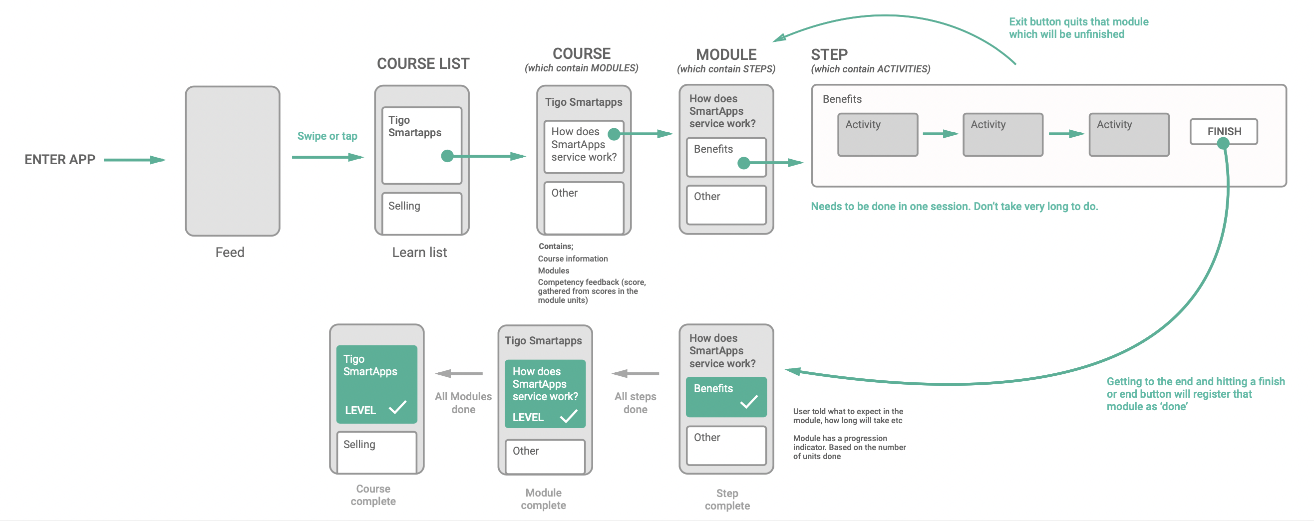
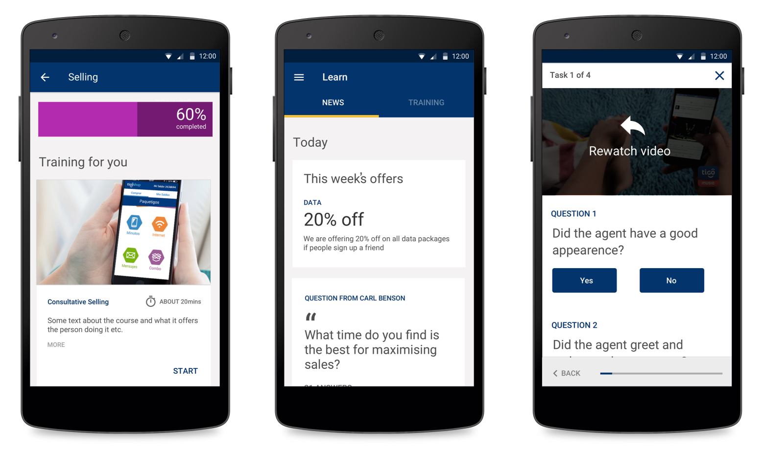
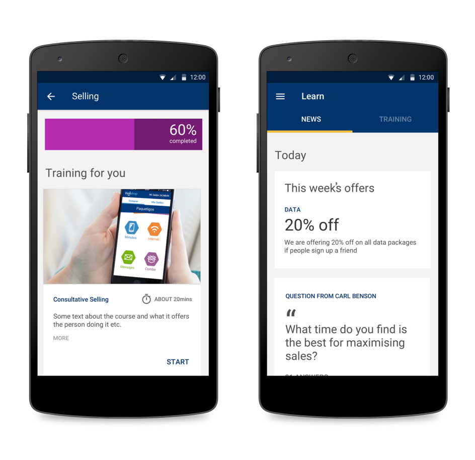
The app structure would be split into two areas - A newsfeed and learning content . I decided to use a feed as it was a familiar UI to hold a stream of content - new items come in the top, older towards the Botton. It would be a mix of the short, timely messages and updates which Tigo regularly send but also will push learning content through here to make this the central way to start content journeys.
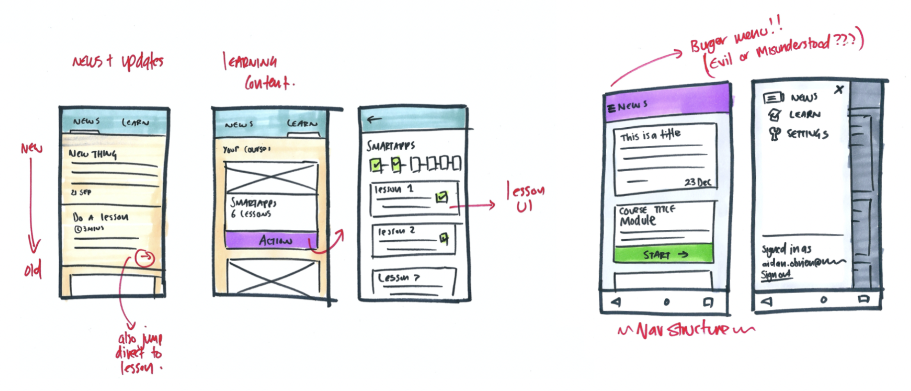
Tigo needed to send and control their updates in a secure way but we didn’t have time to build out a full CMS system for them - I suggested delivering these through a locked Twitter feed which would pull in the raw data and render it in the app. This worked a treat and was nice and secure.
For lesson flows, it was important that this be a learning tool, not a testing tool. We would have an input of information (for which we were using video) and follow up with a quiz to check knowledge retention. The user keeps trying till they get right answer layered with helpful feedback if they get anything wrong or extra context when they get it correct. Also looked at the types of input we could have in the future that the navigation model worked for them.
I worked up a few prototypes to run by the training leads.
To save time on look and feel - I opted to use the Android design library - Material was starting to come out around then but was still relatively young but had most of the design elements we needed. It would be branded Tigo using their blues/yellows. The key thing was that this wasn't a visual exercise - we wanted to validate this approach so using the Android library was perfect
What went well?
What didn’t go so well?
The MVP was out there and was a succeeded enough to unlock Tigo budget for a phase 2. This would mean building the app for real. We were also having conversations with other companies that they needed a similar tool. So the next part of the story is building EduMe. For real.

Aidan was with eduMe from the start and was pivotal in driving the product from a proof of concept MVP to a successful offering with product market fit. Grasping complex problems quickly and turning them into working products for users is his superpower and will mean you are able to iterate with speed and build products customers want.

Jacob Waern, CEO & Founder


Backend dashboard for eduMe allowing customers to manage learners and content

Building a flexible data system so content can be brought into a view depending on context.


