
EduMe is a workforce training platform aimed at the deskless workforce providing a seamless learning experience integrating with existing systems and processes.
Leading product and design for EduMe. Eventually I would build out a team but for now would be the sole designer and product person. Working across commercial and dev teams as well as working closely with the CEO.
Content completion up from 70% to 90%
Revenue up by 66%
$80k a year saved in training costs
Build on and improve the MVP that was validated from the previous experiment and create a better quality v1 of EduMe that could bring value to other companies.
We had produced an MVP for providing a way to deliver learning content to a dispersed workforce over an Android device (go here for the case study on this). It was successful in that sales revenues increased and content completion was high, there was some feedback to address but overall we believed the core experimented was validated. I would now look to build this in a more scalable way as more use cases from other companies were coming onto the radar.
Issues with the current MVP to address
Although mostly positive there was some great feedback from users to work on...
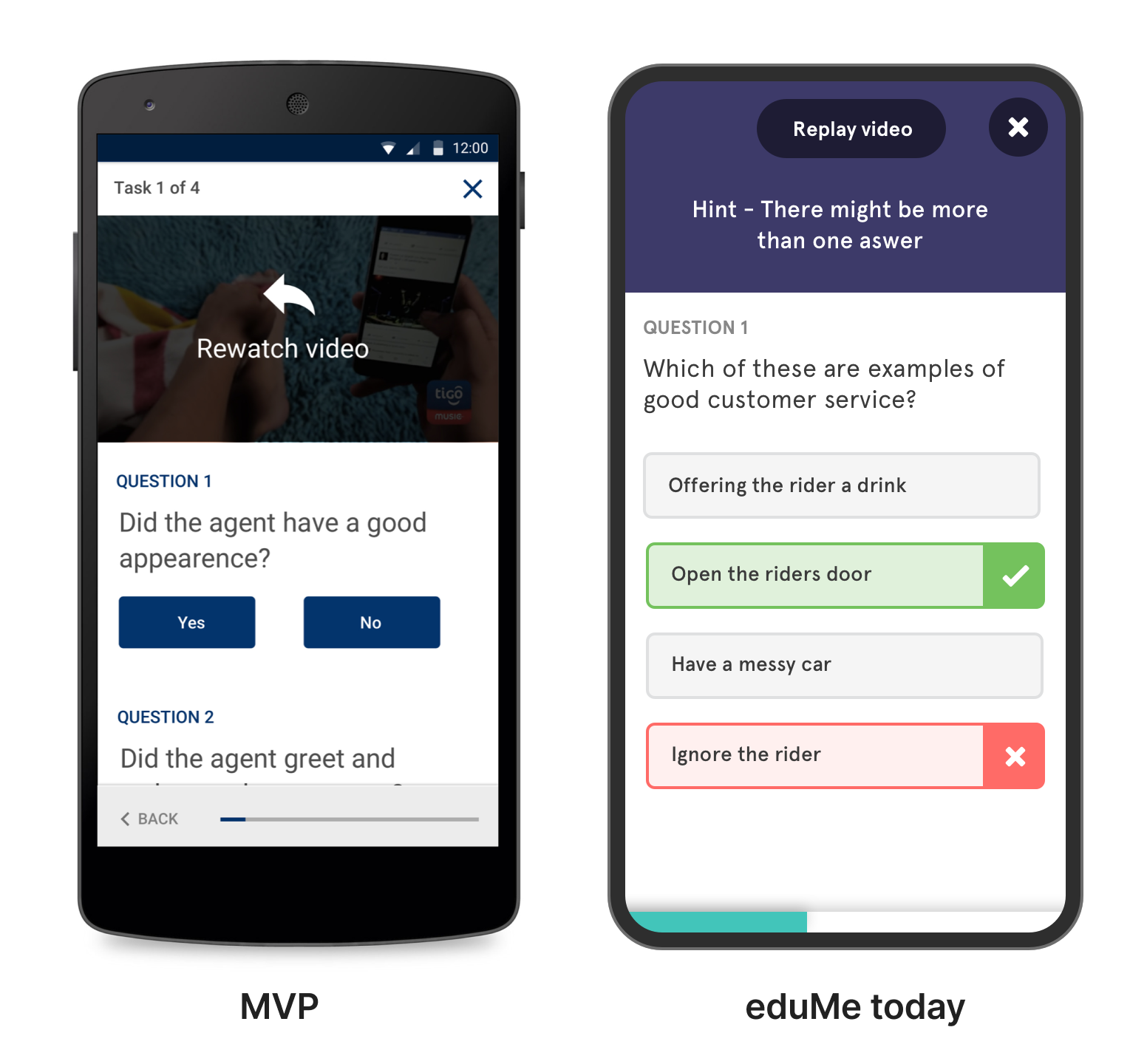
👎 Why should I do this?
Not clear why they were being asked to do this content and what benefits it would bring
👎 Lesson content flow was complicated and easy to get lost in
Progress was hard to work out
👎 Users found the feed confusing
Overwhelmed, not sure what was new vs old and no longer relevant. Could get lost and waste time
There were a number of issues with the feed we had tested…
Users were overwhelmed and confused, old information was still there and out of date so it was hard to sort through what was still relevant. Feeds being endless never give a true feeling of closure
I didn’t want learners feeling pressured that they hadn't done enough. They should be able to do some content, feel like they have accomplished something then stop and come back another time - a principle I called out earlier - put learners in control
The feed felt good for the top few slots - so I tried having a 5 slot list with a ‘load more’ button to get more if they had more time. But this still didn’t feel right and still didn't give closure.
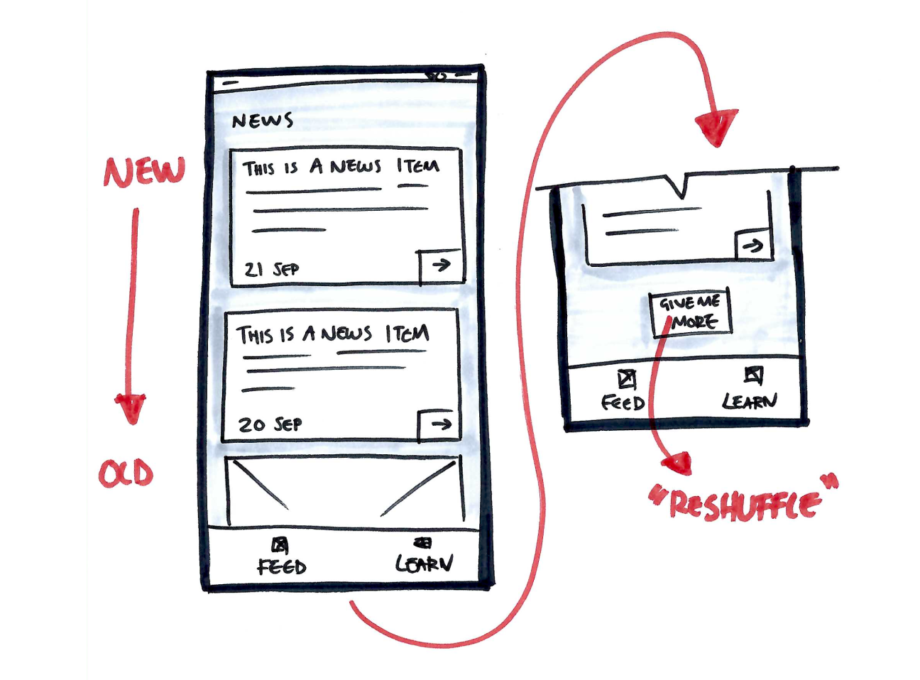
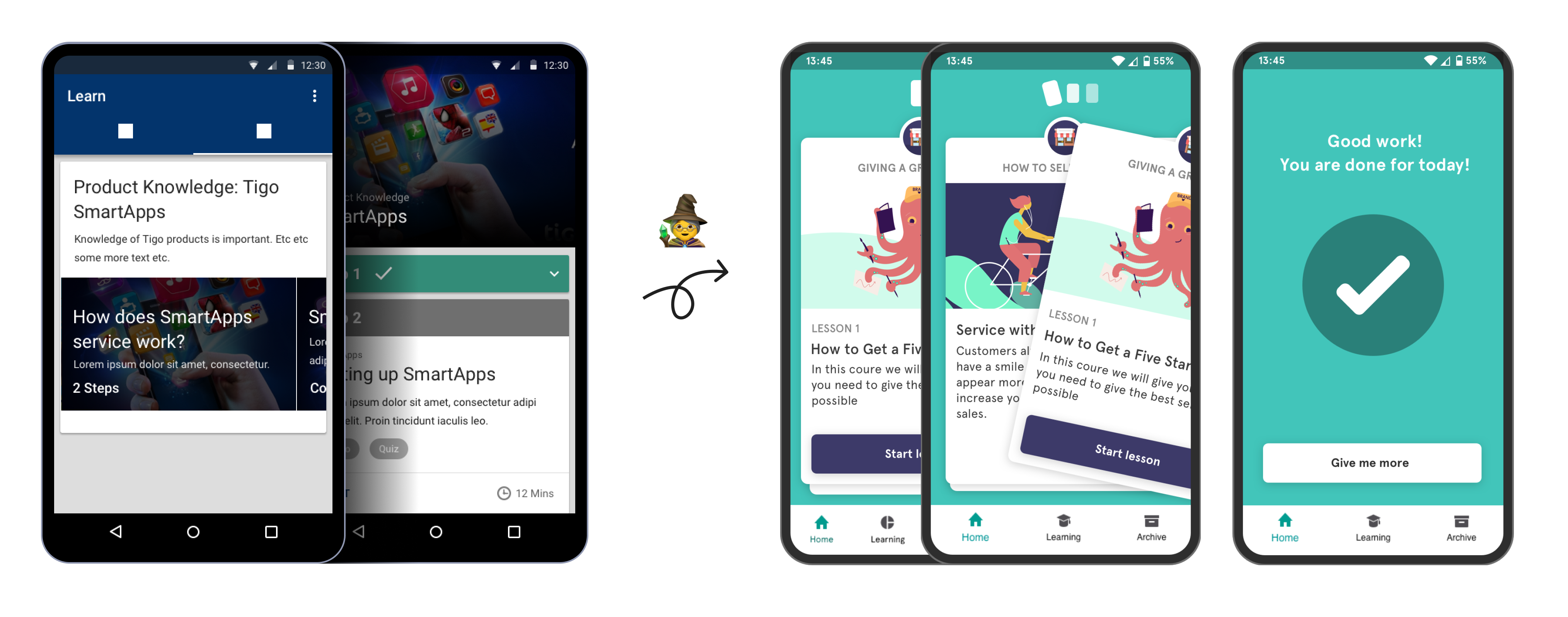
I wanted to create a daily snack of things they can do.
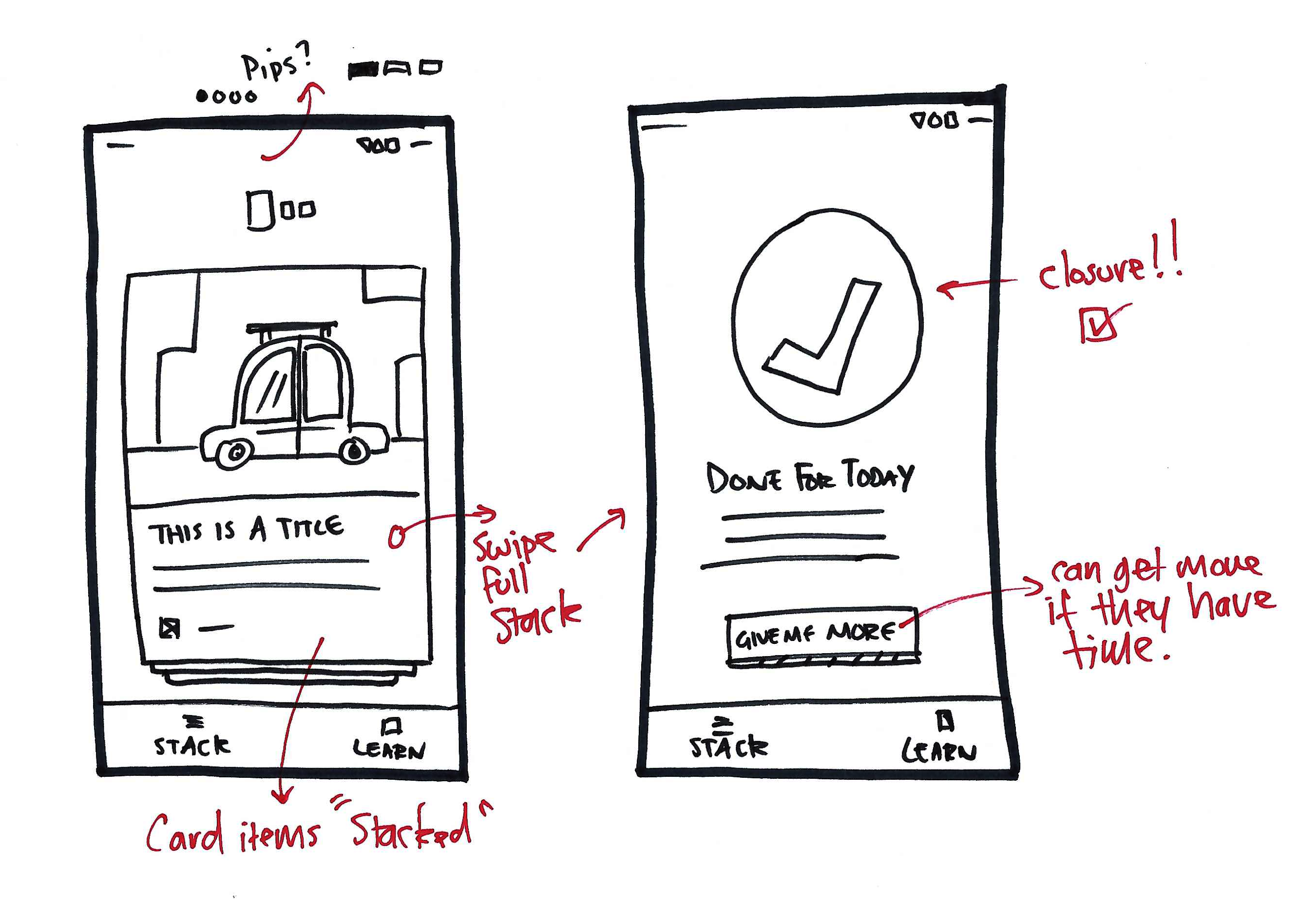
So I played with the idea of a 'stack' of cards, that almost felt physical - a pile of things the app has selected for the user to do in one session that will take no longer than say 6 minutes. Then there is some feedback that they are done for the day and give a sense of closure.
If they have more time there is a ‘give me more’ button which allows folks to go a bit deeper if they like but the idea is not to pile on pressure.
I started exploring what kinds of 'cards' could appear in the stack; Lesson cards - would lead to the longer form learning content - Message cards - would be the smaller updates - these could just have text but also have images or video attached
Cards felt like they could be very scalable, we would start with these two types but eventually could spin up different types be it simple polls/surveys, pop quizzes etc.
I was still using Android look and feel at this stage - but while this was going on - we were speaking to other companies about the product and it was feeling like it had wider commercial potential than just Tigo - I started to move away from the Android look and feel.
We would still follow design patterns familiar with the platform the product is on (EduMe would also have an iOS app and web experience later) I wanted to have a core EduMe feel that could then be easily skinned for other clients later down the line - making it super flexible for other use cases
I wanted to create a look and feel that wasn’t too formal, was fun but remaining trustworty.
It needed flexibility that if you dressed the content with playful imagery it wouldn’t feel silly, likewise, you can use more corporate imagery and it kind of makes it more serious for these types of clients.
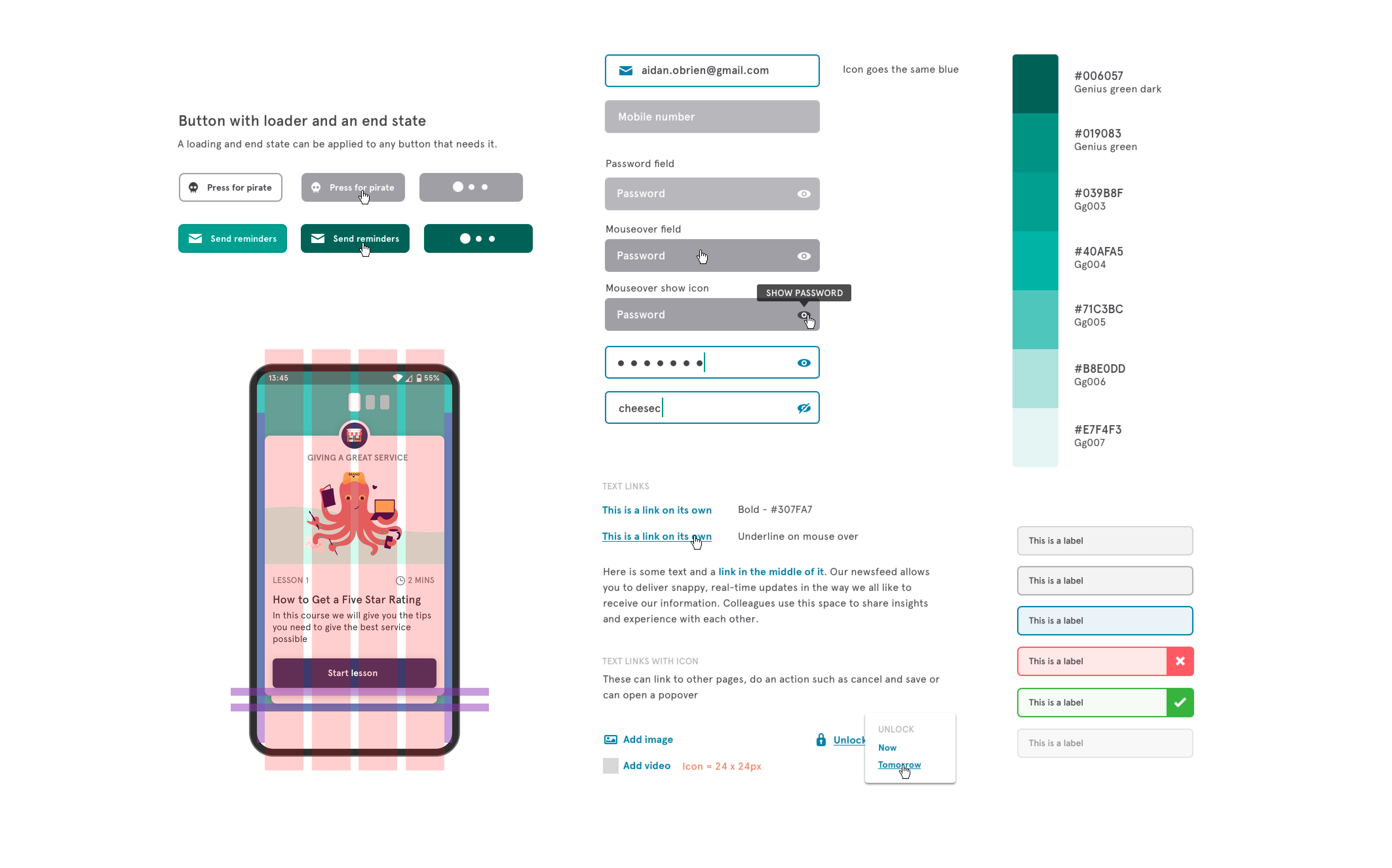
Use of rounded edges, thicker strokes on form fields and buttons to have less formal feel.
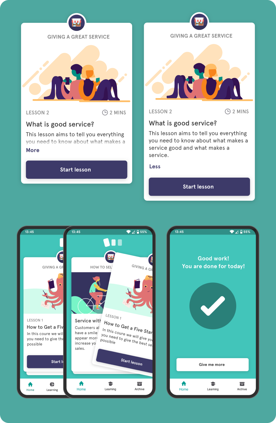
For the stack I used a generous drop shadow to give that feel of a physical stack of cars, this was intentionally over exaggerated and the angle of the y shadow set to 0 to really lift it off the background. The interaction is a nice ‘fling' as you throw it. I sat with devs for a while to get this right.
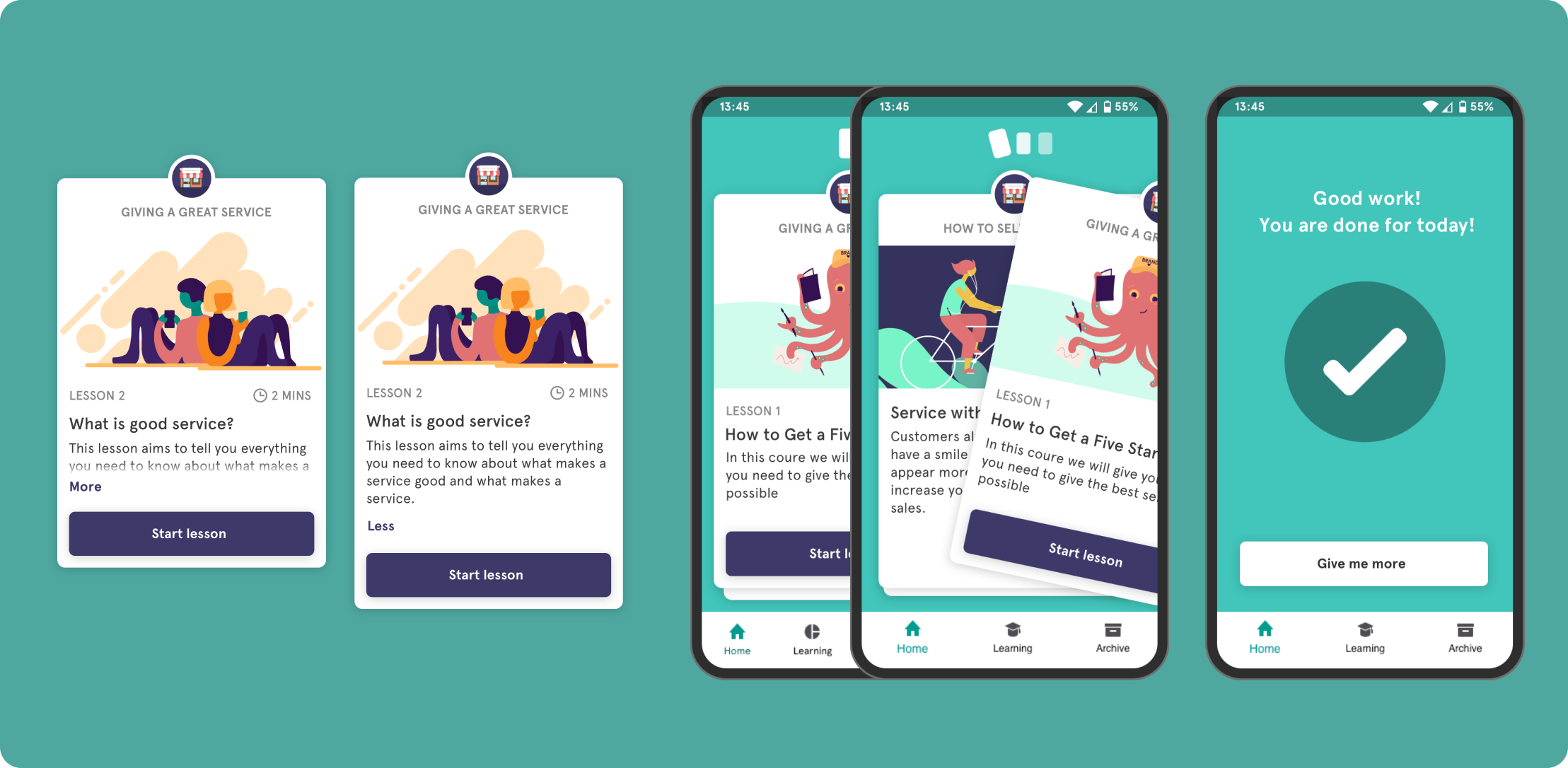
In terms of hierarchy - the lesson title should feel the most important piece of information - tapping into the feedback we got from the MVP to expose why they should be doing this. This was slightly larger text and sentence case along with the description so it's easier to read and scan as these change the most across different lessons Use of uppercase for course titling, lesson and time to give structure to the card. If There is too much information the card can be expanded - the whole area was tappable so you don’t have to hit the fiddly ‘more’ link but I still raised it up a but from above the button so people didn’t accidentally hit start when trying to expand
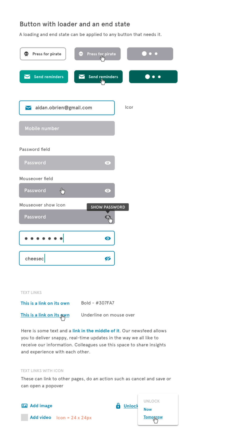
I came up with a design library to create all the elements we would need to save time and create a bit of consistently as we were moving so fast. The typeface I used was Apercu - a clean sans serif font that looks great in a paragraph. The colour palette came from the limited colour EduMe had from being part of Milicom - a teal colour as primary. Then all colours had a light/dark with 5 shades between for flexibility. The main brand colours in the app, button colours etc are all built in a way that they can be easily changed per company we work with to have greater branded experiences for each client. The system was to span EduMe as a whole, so it had to evolve as EduMe grew - it's man purpose was to save time when spinning up UI experiments. It covered the internal dashboard, a client dashboard and content creation tool, learner app on iOS and android and a web version
The levels of content of course - module - lesson - steps then types was too complex for the users in our testing so this was dramatically simplified.
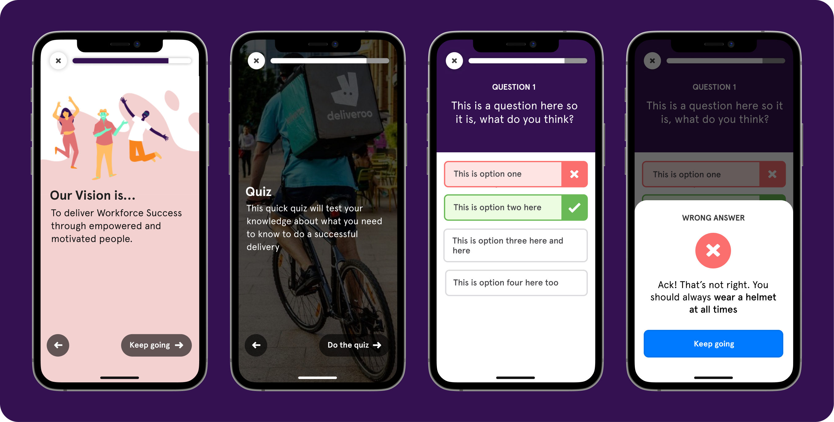
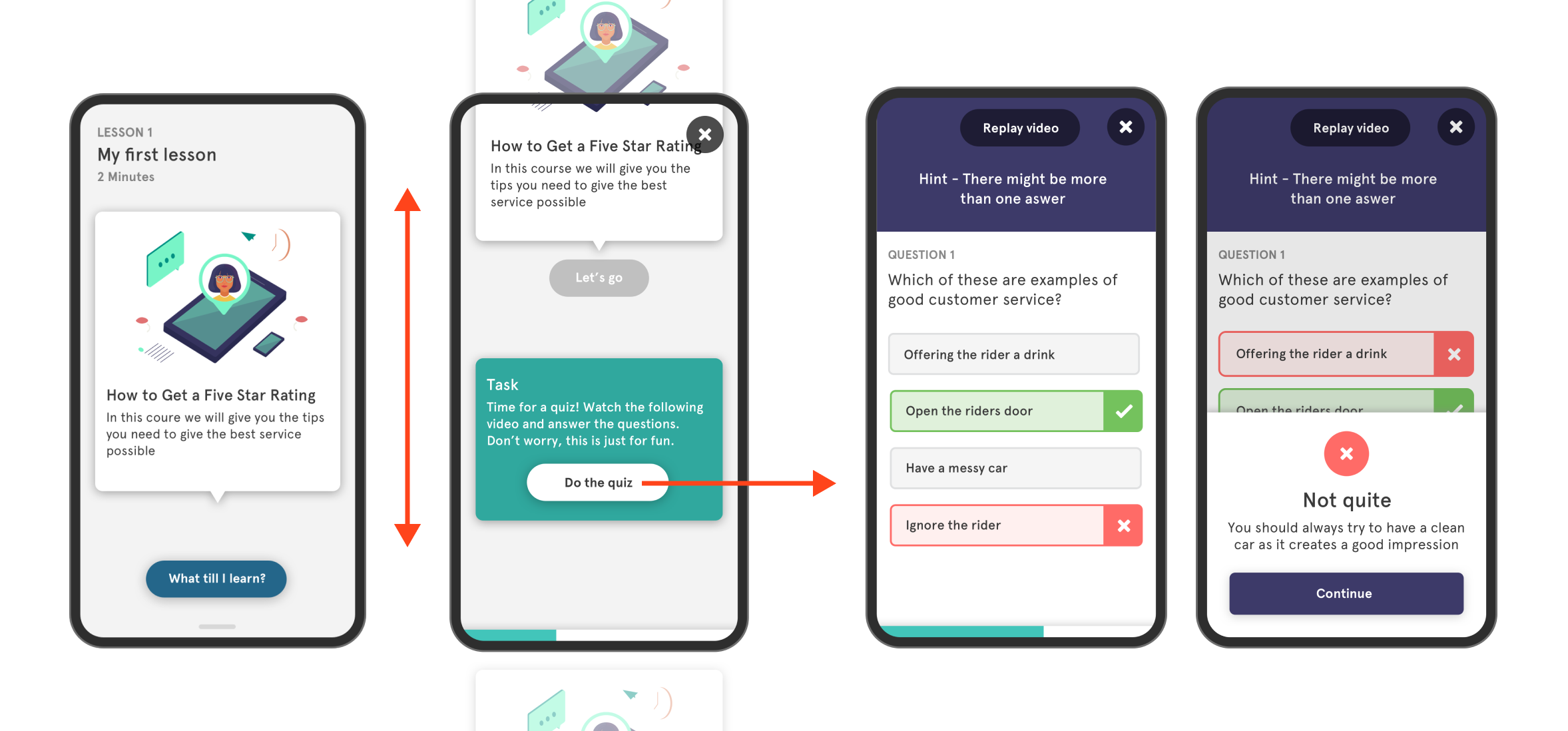
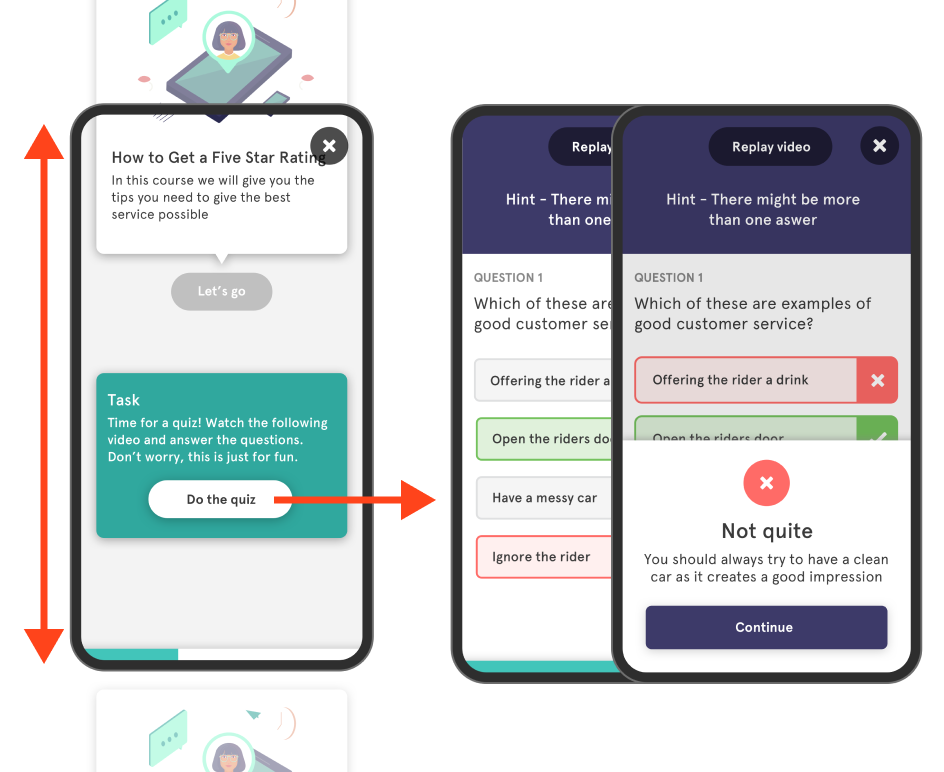
I wanted to look at the lesson flow and had the idea of the experience being conversational. The learning designer had a very conversationa way of writing her content so this inspired me to see if the UI could be the similar so I played with some ideas of a bot type UI. No back button using scrolling to go back to previous info cleaned up the UI - simple single ‘next’ button to move on as a single primary action
Main thing around the concept was focus. Simple navigation - up / down motion for content the learner reads or watches then there is a visually different looking task box as an intentional break to the flow. Tapping this action then shifts the focus sideways into an activity where the learner now needs to interact and eventually brought back into the lesson flow when the activity is completed. See below ⬇️
What happened next? Tigo continued to succeed..

Aidan was with eduMe from the start and was pivotal in driving the product from a proof of concept MVP to a successful offering with product market fit. Grasping complex problems quickly and turning them into working products for users is his superpower and will mean you are able to iterate with speed and build products customers want.

Jacob Waern, CEO & Founder


Backend dashboard for eduMe allowing customers to manage learners and content

Building a flexible data system so content can be brought into a view depending on context.


